
MY MIGRAINE DIARY
A migraine tracking app that’s simple, intuitive, and stress-free—even during an attack.
About the project
As a UX/UI designer with a pharmaceutical background, I’ve worked closely with patients struggling to track symptoms during a migraine attack. I know how overwhelming and frustrating it can be. Hence the idea to help these people track their migraine episodes by creating a simple and intuitive app that does not overload them, even during the most severe attacks.
The challenge
Make migraine tracking effortless, even in moments of discomfort.
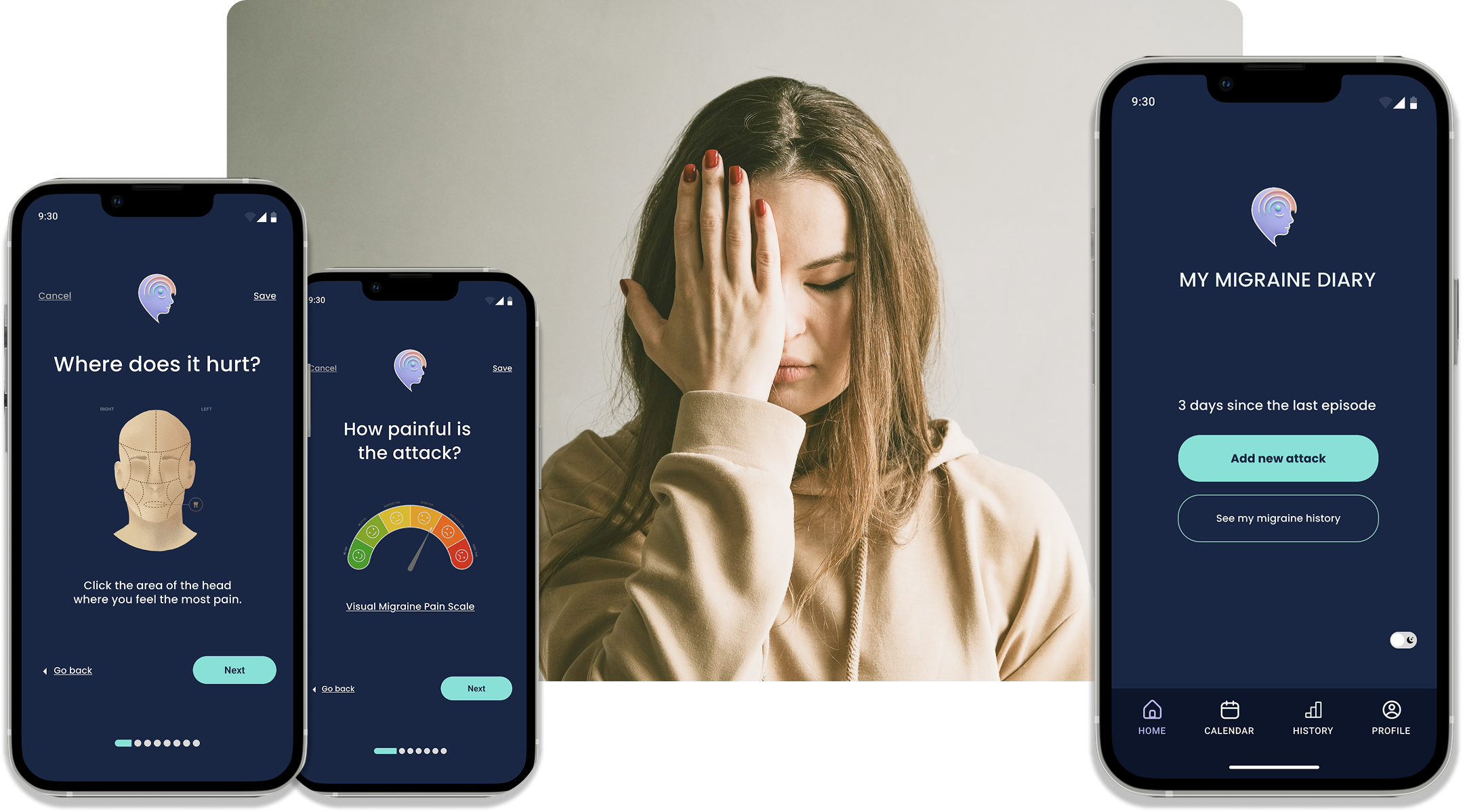
My focus? A clean, intuitive homepage with a clear call to action (CTA) that allows users to log a new attack in just a few taps. The flow is designed to be as simple as possible—short, clear questions, empathetic language, and a reassuring tone to guide users smoothly through the process.
Since light sensitivity is a common issue for migraine sufferers, I also introduced a light-to-dark mode toggle, allowing users to reduce eye strain with ease.
Design process
Phase 1: Research and analysis the results — What’s the problem? From unstructured data to structured insights.
Phase 2: From scratch to Hi-Fi prototype — The solution! From initial concepts to high-fidelity prototype, let’s solve the problems.
Phase 1: The problem
Phase 2: The solution
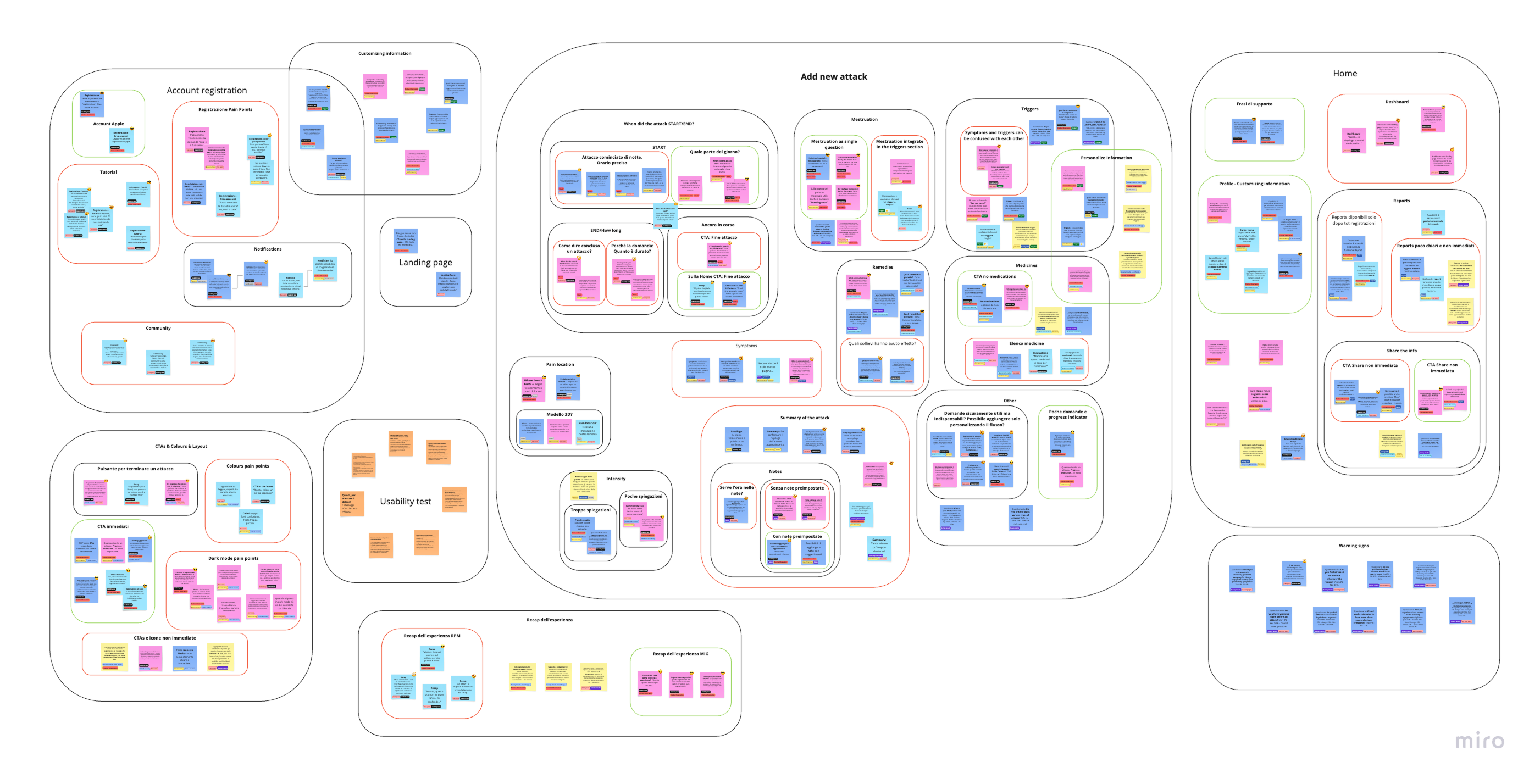
Understanding the problems
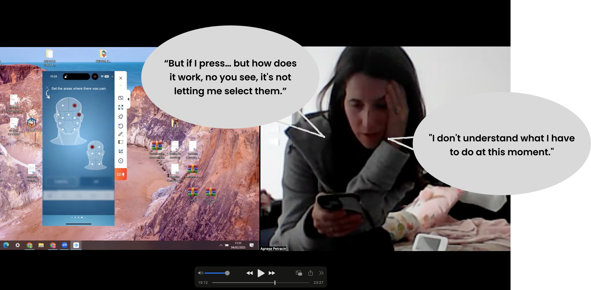
My design process began with in-depth research. I studied popular migraine tracking apps, such as Migraine Buddy and MiG, to understand their dynamics and pain points for users. Subsequently, I listened directly to people living with migraines through survey and usability tests.
A journey into Sophia’s needs
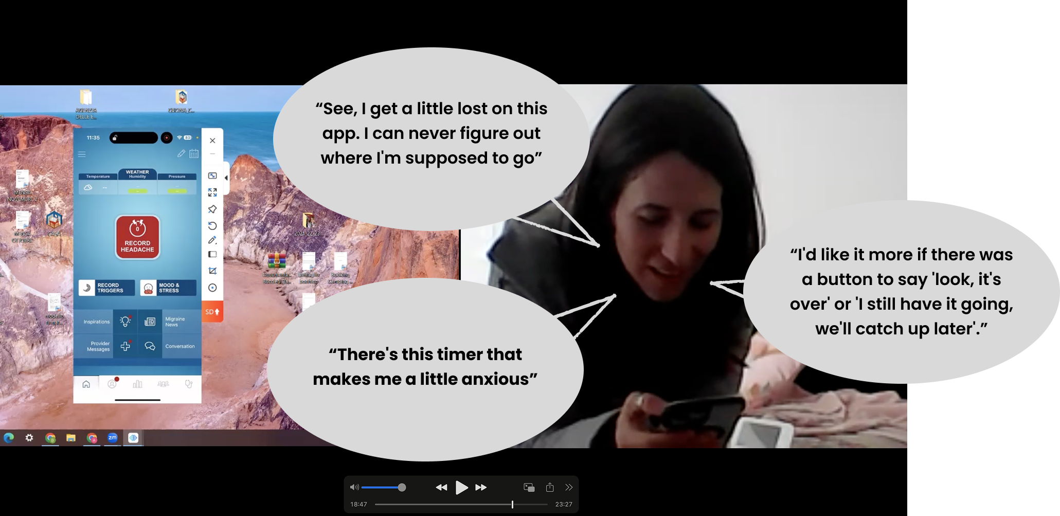
Having collected the raw data through this research, I moved on to the data analysis phase. Using affinity diagrams, I grouped and sub-grouped all the information, which I then used to create a user journey map. This allowed me to delve deeper into the needs and problems of Sophia, a 40-year-old woman who struggles to balance her life as a mother and a working professional due to recurring migraine attacks. Sophia doesn’t even have the time to keep a diary to log her attacks. She would like to log her attacks during the episode itself to not forget details, but the apps tried so far confuse her with too many questions, make her impatient, are too bright, or use disturbing colors like red.
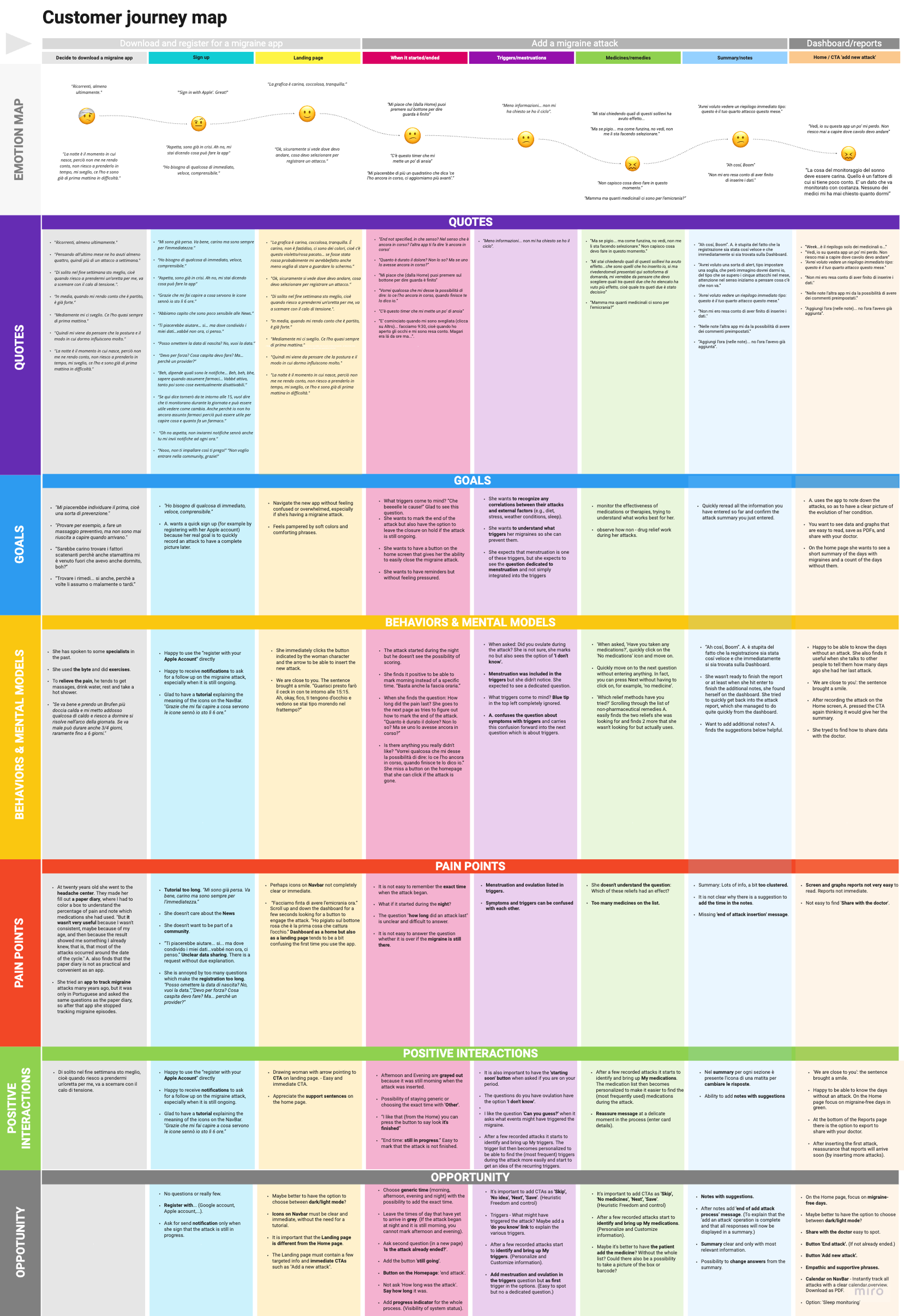
How to make sophia’s life easier – challenges and opportunities
Below are some of the most important challenges and opportunities that the research analysis has highlighted.
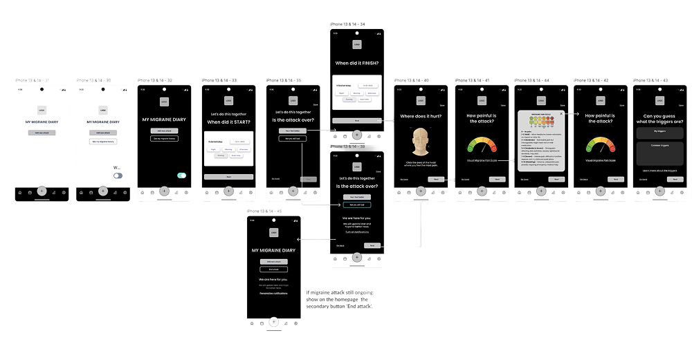
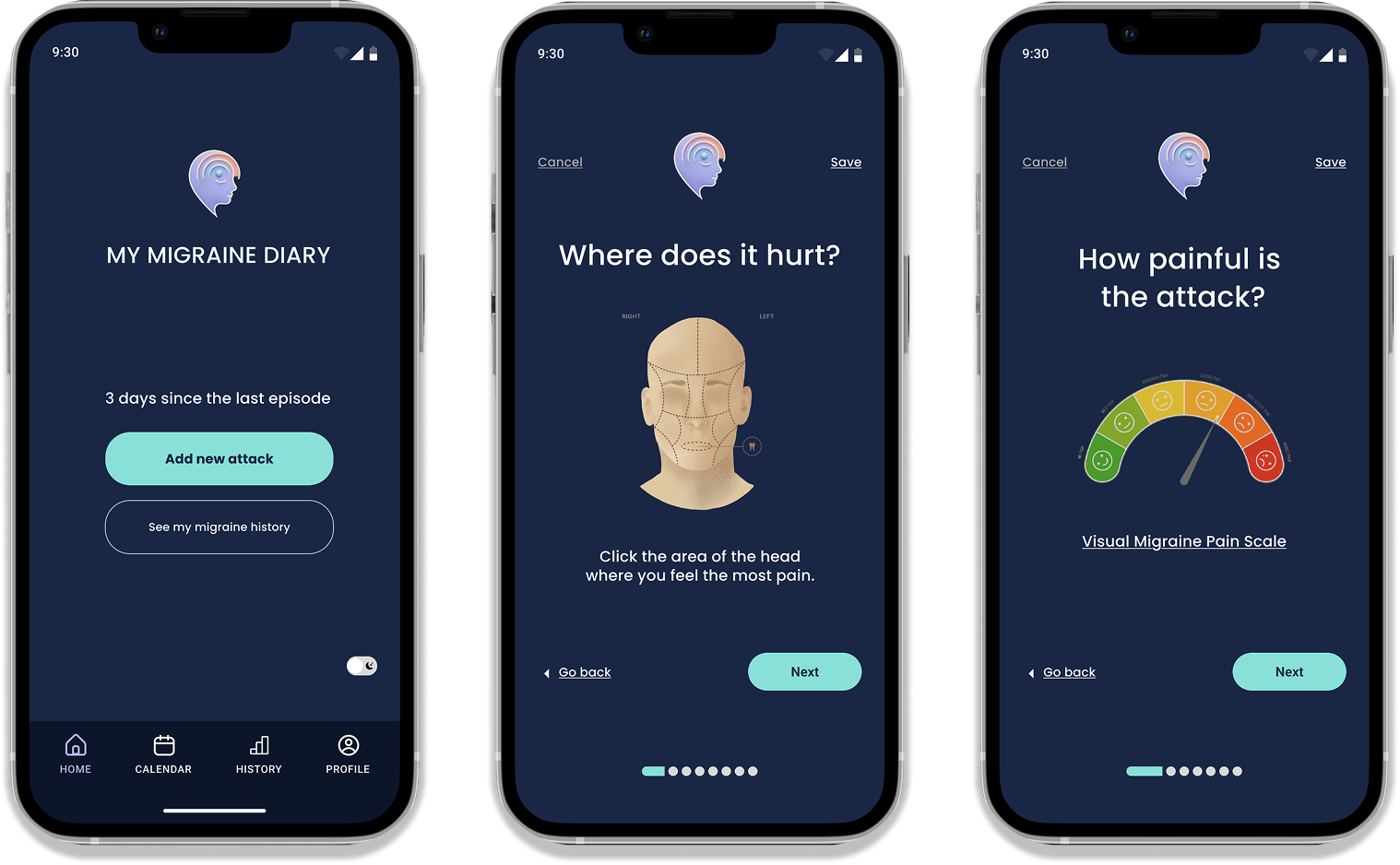
Homepage
- Challenge: Sophia would like to log her attacks during the episode itself to not forget details, but the apps tried so far confuse her with too many questions, make her impatient, are too bright, or use disturbing colors like red.
- Opportunity: A clean, intuitive homepage with a clear call to action (CTA) that allows users to log a new attack in just a few taps. A color palette that evokes calm and relaxation, avoiding harsh tones like red, fuchsia, or orange.
Light sensitivity
- Challenge: Light sensitivity is a common issue experienced by many migraine sufferers.
- Opportunity: To solve this problem, I introduced a light-dark mode toggle directly on the homepage. This feature allows users to easily switch to a darker interface, helping to reduce eye strain.
Simplifying time input for migraine logs
- Challenge: It’s often hard to remember the exact time when the attack started. This is especially a problem if it begins at night, when time gets confusing.
- Opportunity: To solve this problem of uncertain times, we could offer users a choice between general times of the day: morning, afternoon, evening, and night. Plus, we’d give them the option to write down the exact time if they remember it. To avoid confusion, the parts of the day that haven’t happened yet would be shown in grey. For example, if the attack started at night and it’s still morning, they wouldn’t be able to choose afternoon and evening.
‘Add new migraine attack’ flow
- Challenge: Recording a new attack can easily become overwhelming due to the excessive number of questions and the difficulty of formulating them in a simple and intuitive way.
- Opportunities:
- Implement a clear progress indicator at the top of the ‘add attack’ process. This will provide users with a constant sense of where they are in the flow and how many steps remain. (Jakob Nielsen’s heuristic of Visibility of system status.)
- Add links or buttons as ‘Skip’, ‘No idea’, ‘Next’, ‘Save’. (Jakob Nielsen’s heuristic of Freedom and control.)
- After the user has recorded a few attack instances, the app should begin to intelligently identify patterns and proactively surface personalized suggestions for ‘My medications’ and ‘My triggers’ within the ‘add attack’ flow. (Alan Cooper’s heuristic of Software should be interested in me – Personalize and Customize information.)
- Within the ‘Add notes’ section, provide users with helpful suggestions.
User-friendly end attack options
- Challenge: Sophia found it confusing when the app asked her to specify when her migraine attack ended, especially since she was still in pain and couldn’t easily indicate that the attack was ongoing. Furthermore, once she managed to log that the attack was still happening, the app overwhelmed her with repeated notifications asking if it had ended, which caused her anxiety.
- Opportunity: To address this, after the initial question about when the attack started, I will introduce a new page asking: ‘Is the attack already ended?’ This will provide a clear way for users to indicate if the pain is still present. Additionally, I will add a secondary ‘End Attack’ button to the homepage for easy access when the user knows the attack has finished. Below this button, I will include a link to ‘Customize Notifications’ that will allow users to personalize how often they receive reminders asking, in an empathetic and reassuring tone, if their attack has ended, avoiding the anxiety-inducing experience Sophia encountered.
Accessibility
The EAA is a European Union (EU) directive (2019/882) that aims to harmonize accessibility requirements for a wide range of products and services, including mobile applications, across EU member states. The EAA requires that covered products and services are perceivable, operable, understandable, and robust (POUR).
- Opportunities:
- Perceivability – Implementing text alternatives and high-contrast options improves accessibility for all users, not just those with disabilities.
- Operability – Introducing a voice dictation option at the end of the “add a new attack” flow would allow users to easily record notes about symptoms, triggers, or medications without typing — an essential alternative when fine motor skills are impaired, such as during a migraine. Even users without motor difficulties would benefit from a faster, more convenient way to add detailed information, enhancing the overall user experience.
- UnderstandabilityUsing simple language and clear navigation will make the app easier and faster for everyone to use, improving user satisfaction.
- Robustness – Ensuring compatibility with assistive technologies like screen readers.
Phase 1: The problem
Phase 2: The solution
Moodboard
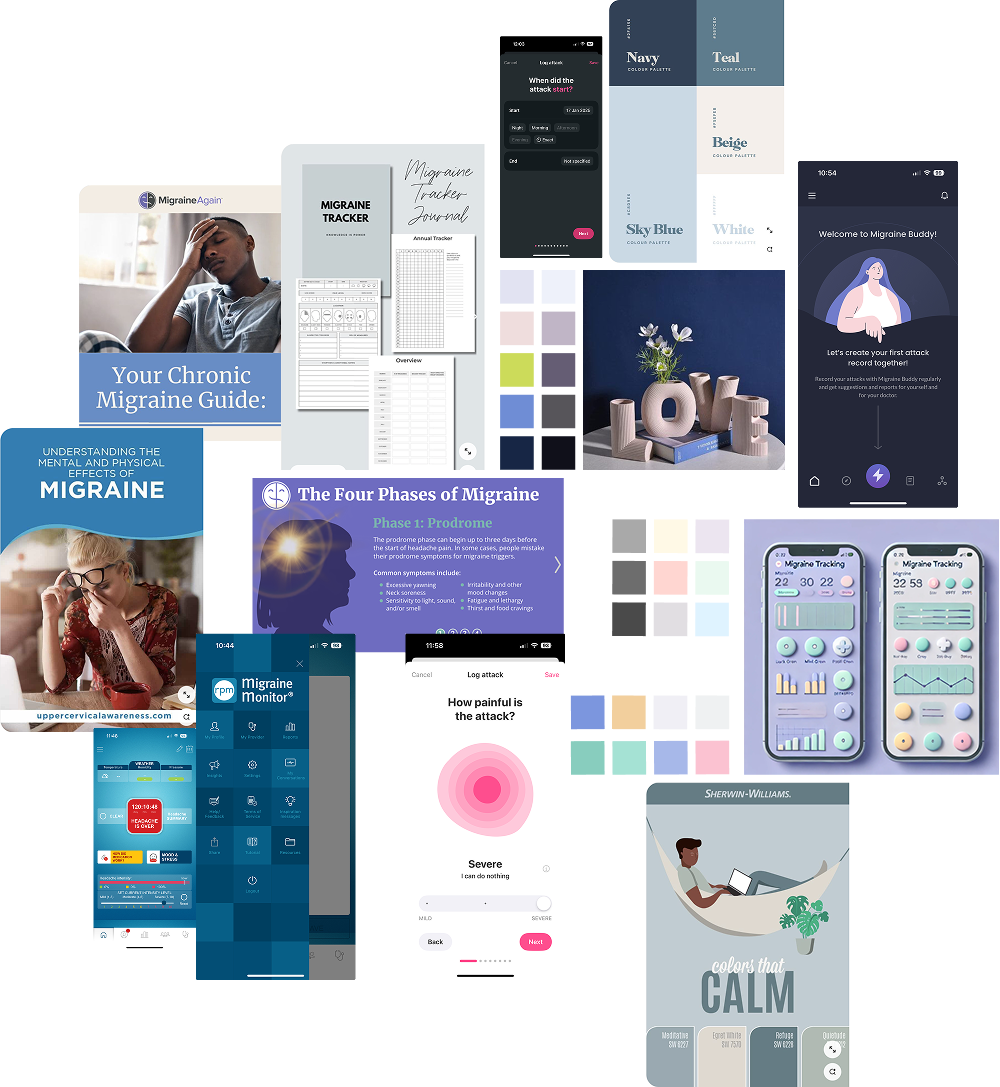
To effectively visualize and communicate the emerging design direction, I curated a mood board of visual references. The mood board effectively communicated the desired look and feel, and the intended user experience for the migraine tracking app.
I researched competitor offerings – existing migraine websites, apps, and tools – and also explored broader design trends and inspiration on platforms like Pinterest and Dribbble.
To ensure the visual design of the migraine app effectively communicated its core qualities, I examined other websites, products, and designs that embodied these characteristics:
- Clear – I identified examples that prioritized ease of use through the strategic use of white space and clear, legible typography.
- Calm – I found images, texts and websites that showed a calm atmosphere through the use of peached and serene colours.
- Soft – I looked for designs that conveyed a feeling of softness through rounded shapes.
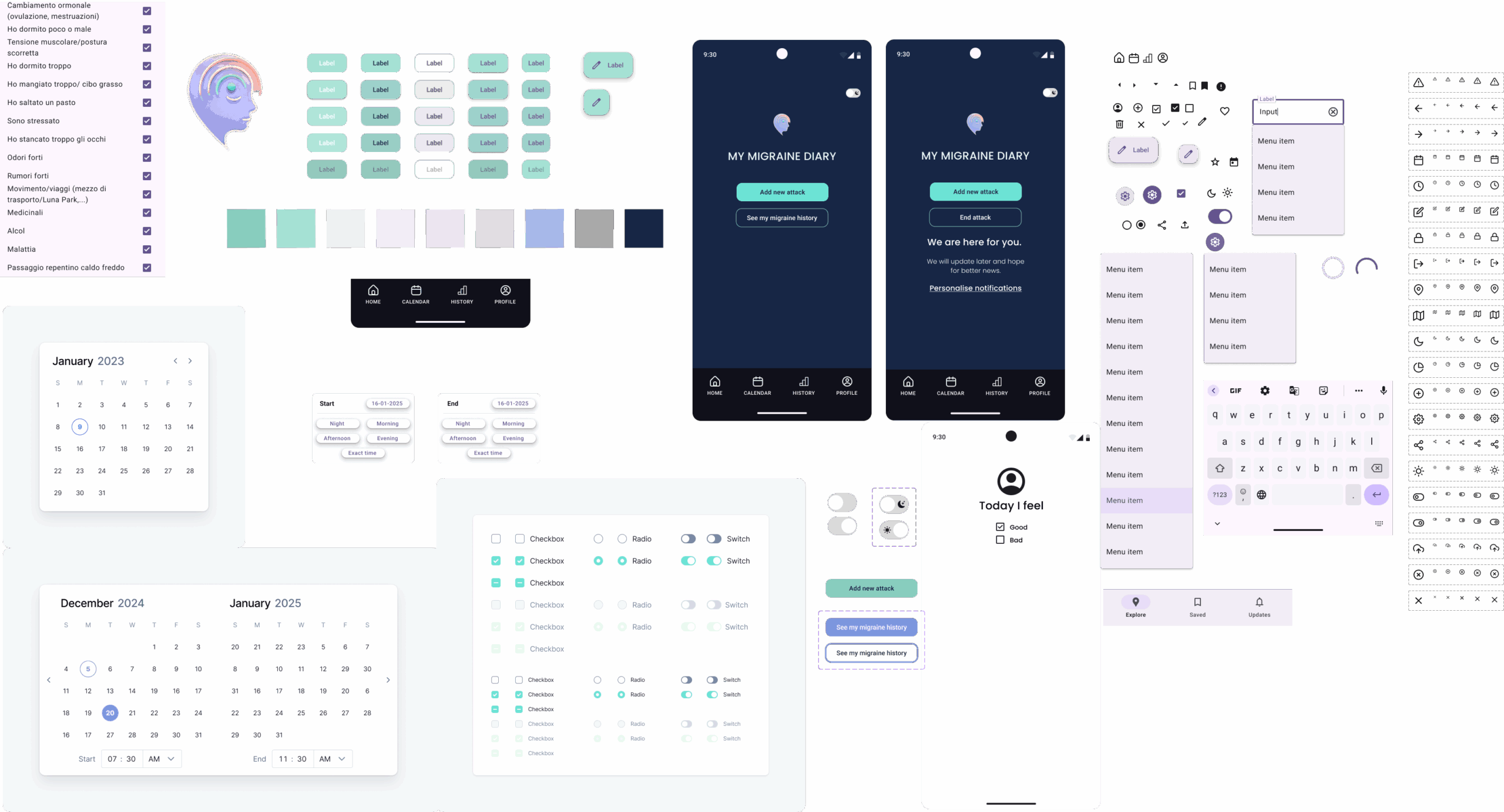
Design system
After defining a visual direction with a Mood board, I created a basic design system, inspired by popular web design element libraries, such as Google Material Design, to ensure consistency throughout the website. This included defining the color palette, typography, and basic UI elements.
I carefully selected a color palette that evokes calm and relaxation, avoiding harsh tones like red, fuchsia, or orange. I also opted for a dark background and soft, rounded lines for icons, buttons, and UI elements to create a more soothing visual experience.
For optimal user experience, particularly considering potential visual sensitivities associated with migraines, I’ve selected the Poppins font. Its clean, sans-serif design prioritizes clarity and ease of reading. The distinct letter shapes and generous spacing contribute to a comfortable visual experience, ensuring that tracking and reviewing information is as effortless as possible. The modern and approachable feel of Poppins also helps create a less clinical and more supportive environment within the app.
From Lo-Fi to Hi-Fi prototype – to help Sophia have a stress-free experience
The design process
The initial focus was on understanding how users would navigate the app, with a particular emphasis on the critical flow of ‘entering a new attack.’ This core functionality, central to the app’s utility, was meticulously mapped out through user flows to ensure a seamless and intuitive experience.
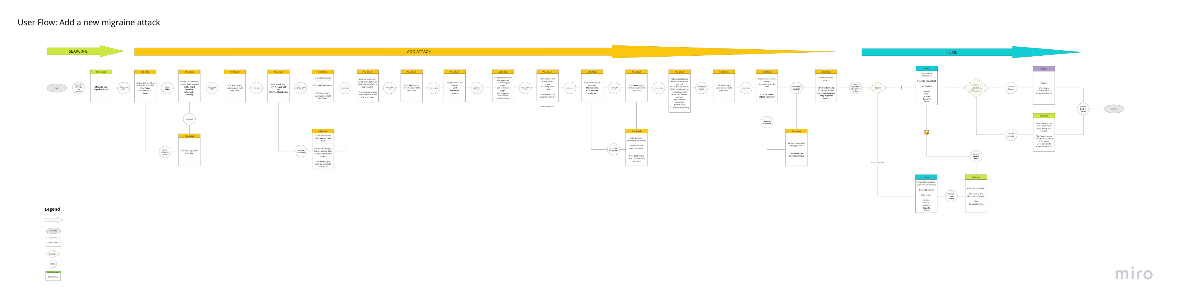
After understanding how users would move through the app, I started to make these ideas visual with quick sketches. This helped me explore different ways the app could look and how users would tap and interact with it. I then turned these sketches into simple, basic LoFi prototypes.
During this early design phase, I always focused on making the app easy to understand right away. I wanted users to instantly know what the app was for (‘What does it do?’), what they needed to click or tap (‘What do I need to do?’), and where to start (‘What do I do first?’). This focus on clear understanding from the beginning helped me build a solid foundation.
These simple prototypes and my learnings from them then led me to create the more detailed and visually polished high-fidelity prototype. This is where I added the final look and feel, making sure the core part of the app – ‘entering a new attack’ – was smooth, intuitive, and directly addressed what users needed, based on the clear principles I established early on.
Looking ahead
The journey for this app isn’t over yet. The next phase involves fine-tuning all the features and conducting usability tests to gather feedback from potential users. This iterative process is essential before considering a final launch, ensuring the app is as helpful and user-friendly as possible.