
Pharmacy’s Responsive Website
Creating an intuitive and informative online platform that effectively showcases two pharmacies on the homepage, addressing user needs and business goals.
About the project
I designed and developed a responsive website for a client with two pharmacy locations, aiming to give equal prominence to both on the homepage without overwhelming users. The primary challenge was balancing the client’s desire to showcase both pharmacies – particularly highlighting promotions for one location featuring an exclusive beauty cabin to boost its efficiency – while maintaining a clear and smooth experience for the user focused on their needs.
The challenge:
The client, owner of two distinct pharmacy locations, required a single website that gave equal prominence to both on the landing page. This initial request presented a design challenge: how to effectively balance the visibility of two separate entities within a cohesive and user-friendly interface. Furthermore, the website needed to address key user needs, such as finding opening hours, locations, services, and contact information quickly and easily.
My design process was rooted in understanding both the client’s business objectives and the needs of their customers. This involved a multi-faceted approach:
Phase 1: Research and moodboard
1. Understanding user needs & business goals:
Before diving into design solutions, I focused on connecting the client’s desire for equal representation of both pharmacies with the practical needs of their customers. This understanding was a must and guided all subsequent design decisions.
2. Research & analysis:
In this phase I focused on identifying the user’s problems and needs:
Therefore, I conducted competitive benchmarking, starting with local pharmacies near my client to understand their strengths and weaknesses. I then expanded my analysis to pharmacy chains to identify strategies for showcasing multiple locations on a single site. Finally, I examined pharmacies with beauty cabins to understand effective ways of highlighting promotions and treatments. Throughout this process, I also focused on identifying common patterns in how pharmacies present essential information to customers, such as location, opening hours, and contact details, as well as their service offerings.
I also created a survey to understand what motivations drive a pharmacy customer to enter the website and what information they would like to find. The research revealed the primary motivations for users visiting a pharmacy website:
- Opening hours: Checking if the pharmacy is currently open, especially on weekends or outside typical business hours.
- Location: Finding the pharmacy’s address, directions, and parking availability.
- Services: Information on services like appointment bookings for diagnostic tests, COVID-19 testing, blood pressure checks, and specialized consultations.
- Specific product availability: Inquiring about the availability of particular medications or the possibility of ordering them.
- Contact information: Quickly accessing phone numbers and email addresses.
- Health advice & articles: Seeking educational content on medications and health supplements.
Additionally, users prioritized the following information:
- Events and promotions: Information on health awareness days or special offers.
- Offered services: Clear details about services like prescription refills, vaccinations, diagnostic tests, and teleconsultations.
- Hours and schedules: Information on regular hours, holiday schedules, and on-call pharmacy services in the area.
3. Mood board & design system:
I searched for inspiration on other pharmacy websites as well as on platforms like Dribble and Pinterest looking for websites and designs that embodied the key qualities relevant to a pharmacy:
Approachable: I explored websites that balanced professionalism with a welcoming and friendly feel, perhaps through the use of calming color palettes, reassuring imagery, or clear and concise language – aiming to create a positive and supportive online experience for users.
Clear: I focused on websites that utilized ample white space, legible typography, and intuitive navigation to ensure ease of use and quick access to information – crucial for users seeking health-related services.
Trustworthy: I looked at websites that conveyed a sense of reliability and professionalism through their design elements, such as a consistent visual language, clear information architecture, and accessible contact details – vital for building confidence with users regarding health and medication information.
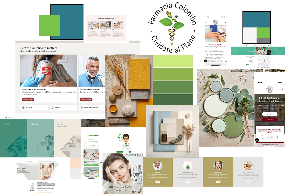
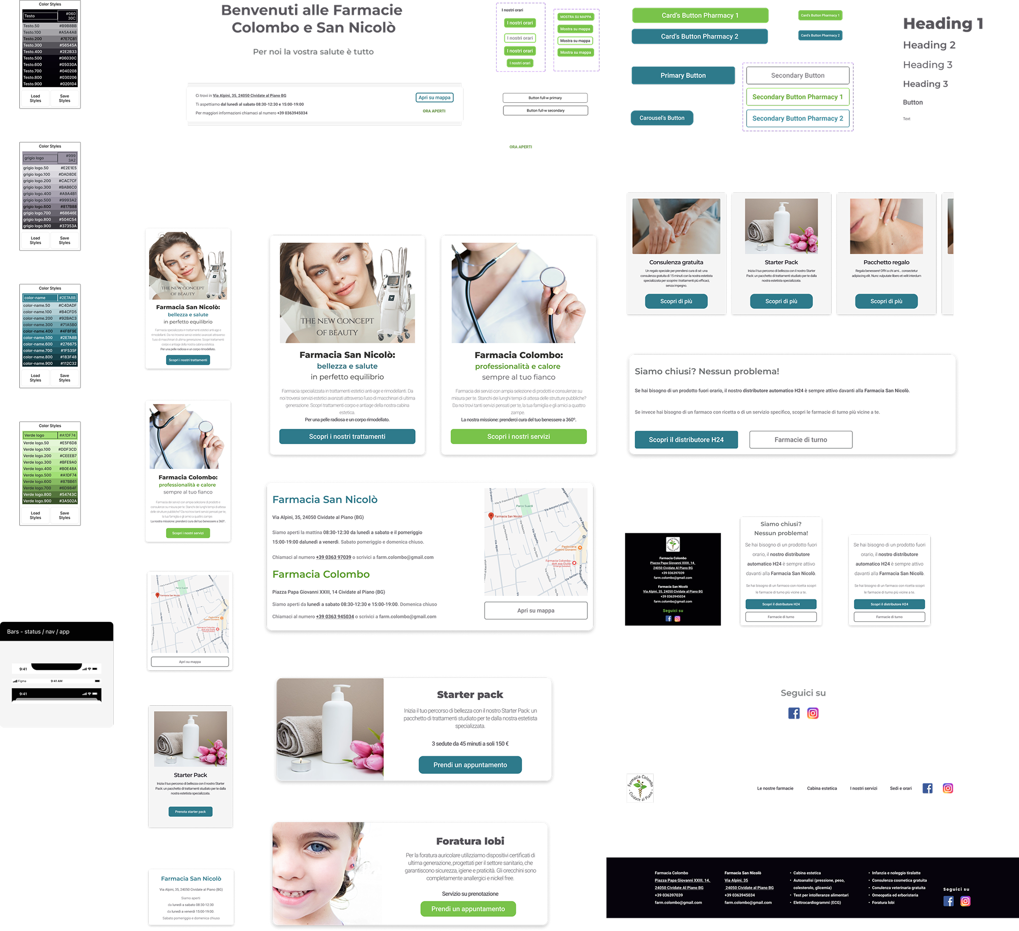
I established a visual direction and created a basic design system, inspired by famous design elements libraries on the web, like Google Material Design, to ensure consistency across the website. This included defining the color palette (minimalist approach with dark text, grey gradients, and the two pharmacy-specific accent colors), typography, and basic UI elements.
Ensuring accessibility and clear communication of information were key considerations for this pharmacy website. I chose Roboto as the primary font due to its excellent readability across various devices and screen sizes. Its clean design ensures clarity, which is crucial for conveying important health-related information. Additionally, as the default font for Android, Roboto offers a sense of familiarity to a large segment of users, potentially enhancing trust and ease of navigation.
Phase 2: Screen design iterations
Sketches & Low-Fidelity prototypes:
Sketches & Low-Fidelity Prototypes: I created initial sketches and low-fidelity wireframes to explore different layout options, focusing on how to present both pharmacies effectively on the homepage and structure the navigation based on user needs. These were shared with the client for initial feedback and approval on the overall structure.
High-Fidelity prototypes:
I developed detailed high-fidelity prototypes to visualize the final UI, paying close attention to visual hierarchy, readability, and user flow. The initial design emphasized clean aesthetics with ample white space.
Initially, the client loved the proposed layout and the research-backed information architecture. However, during the high-fidelity UI prototype presentation, she expressed a desire for a background color and colored titles, particularly liking yellow, feeling the design had excessive white space.
I took the opportunity to explain the design rationale behind the minimalist approach: the deliberate use of ample white space and a monochromatic palette (black and greys) was intended to emphasize the two brand colors, visually distinguishing the two pharmacies without overwhelming the user. However, to better understand her vision, I created several design variations incorporating her color requests.
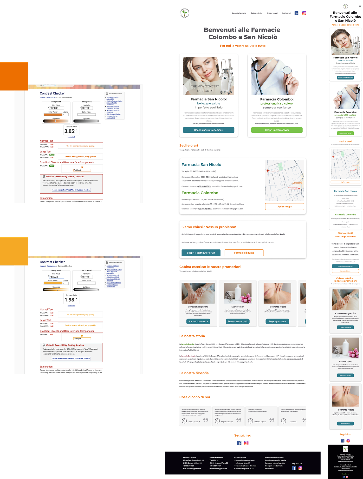
Showing can be more impactful than simply telling
Recognizing that showing can be more impactful than simply telling, I proposed a collaborative usability test. I asked the client to step into the shoes of a website user and guided her through several tasks. This hands-on experience proved to be a turning point. The client directly observed how a busier background and even the orange titles I had used (as a more accessible alternative to pure yellow) made the website feel cluttered and overwhelming, and how straining it was to read the subheadings.
This direct engagement with the prototype, simulating a user experience, led the client to realize the benefits of the original design. Consequently, she requested a return to the initial minimalist aesthetic. To further align the design with her personal preferences and ensure she felt a stronger sense of ownership, I was happy to refine the Call-to-Action button colors based on her suggestions, while still adhering to accessibility and usability standards.
Phase 3: Final screen designs
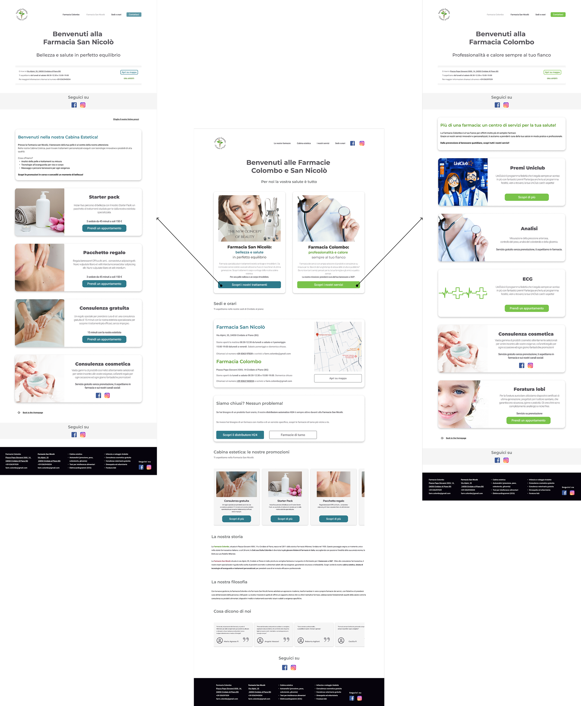
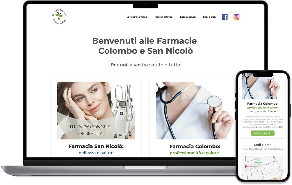
The final responsive website design features:
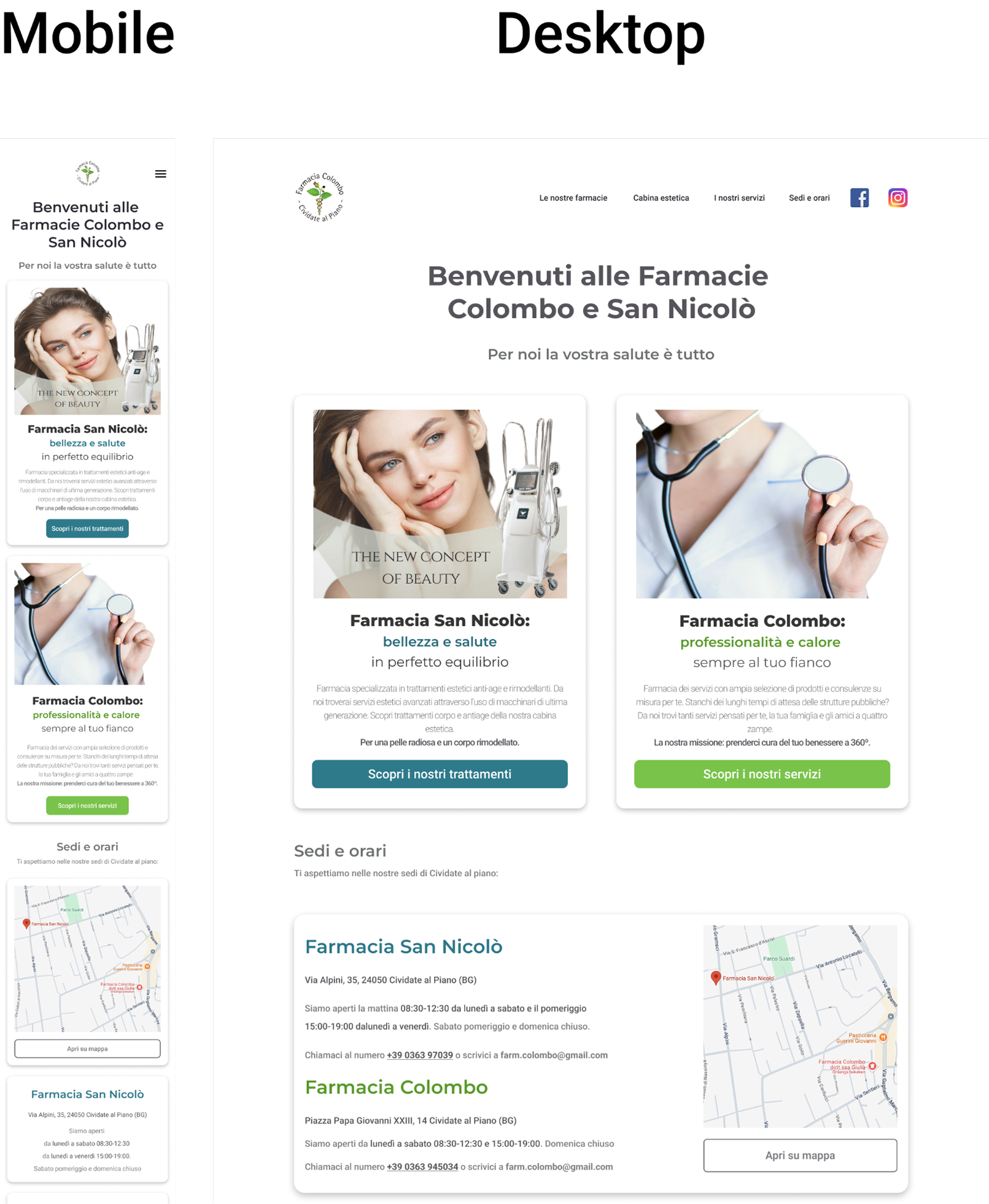
Responsive design: A fully responsive layout ensuring optimal viewing and interaction across all devices (desktop, tablet, and mobile).
Balanced homepage: A layout that prominently showcases both pharmacy locations through distinct cards, utilizing their respective brand colors for visual differentiation.
Minimalist aesthetic: A clean and modern design with ample white space, dark text for readability, and grey gradients to create visual hierarchy without overwhelming the user.
User-Centric information architecture: Prioritize the most frequently requested information, such as opening hours, location details (including maps and parking) and key services, directly on the homepage or easily accessible via clear navigation.
Service highlights: Dedicated sections or visual cues to draw attention to services requiring appointments and current promotions.
Clear contact information: Easily findable phone numbers and addresses for both locations whit a clear map.
Social media integration: Strategic placement of links to the pharmacies’ Facebook and Instagram pages, allowing the client to share updates and engage with customers directly.
Wrapping up
While there is no quantitative data yet on the impact of the website, the client’s enthusiastic feedback on the final design has been incredibly rewarding. She particularly appreciated how the clear information architecture and visually distinct yet harmonious presentation of the two pharmacy locations addressed her initial concerns.
Beyond the end result, this project has provided me with valuable lessons that will undoubtedly inform my future design projects. It has reinforced the delicate but crucial balance between respecting the client’s vision and promoting user-centered design principles, highlighting the power of clear communication and the persuasive impact of usability testing in filling potential gaps. It has also confirmed the power of thorough research in creating effective solutions. On a personal level, it has been a compelling reminder of how my experience as a pharmacist can offer a unique perspective, allowing for a deeper empathy and understanding of the specific needs and expectations of the healthcare context.