
UX/UI team Project: NANNY NEST
Our babysitting platform journey: from idea to concept
About the project
This project began with a clear vision: to build a simple, safe, and user-friendly platform connecting parents and babysitters. As a team of three, we embarked on a journey of user-centric design, starting with thorough research to define the needs of both groups. At first, our focus was on parents, since most platforms seem to prioritise their experience. But we quickly realised something crucial: if we wanted to stand out, we had to deeply understand babysitters’ needs too.
The challenge
When we set out on this research journey, our goal was clear: to understand what it truly feels like to use a platform that connects parents with babysitters. We wanted to step into their shoes—both the busy parents searching for reliable childcare and the babysitters looking for opportunities to work safely and efficiently.
The questions driving our research were simple yet crucial.
- How do users experience these platforms?
- What frustrations do they encounter?
- What makes them hesitate, what makes them abandon, what keeps them coming back?
Through our study, we aimed to uncover the real challenges faced by both sides and pinpoint opportunities to make the platform not just functional, but smooth, safe, and intuitive. Every insight gathered was a step toward designing a system that doesn’t just work but truly supports the people who rely on it.
Design process
Phase 1: Research and analysis the results — What’s the problem? From unstructured data to structured insights.
Phase 2: From scratch to Hi-Fi prototype — The solution! From initial concepts to high-fidelity prototype, let’s solve the problems!
Phase 1: The problem
Phase 2: The solution
Tools and workflow
We used Miro as the main tool for collecting and analyzing data for our research. Collaboration within the team was key: we divided the work based on user flows, focusing in parallel on parents and babysitters.
Understanding the real needs of Maria & Emma
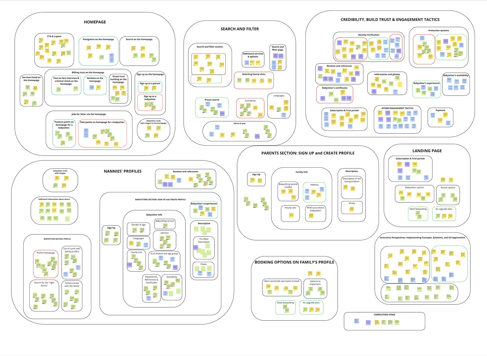
Affinity diagrams
While my colleagues focused on the parent experience, I deep-dived into the research of the babysitter UX, conducting usability tests and a dedicated survey. After countless sticky notes and brainstorming sessions, we used affinity diagrams to group and subgroup our merged findings. Slowly, a clear picture of the common pain points and opportunities for both babysitters and parents emerged.
Maria & Emma journey maps
To bring it all to life, we created two user journey maps:
- Maria, the busy mom searching for the perfect sitter, and
- Emma, the energetic babysitter looking for reliable families.
Through these journeys, we pinpointed pain points, positive interactions, and ways to improve the experience for both.
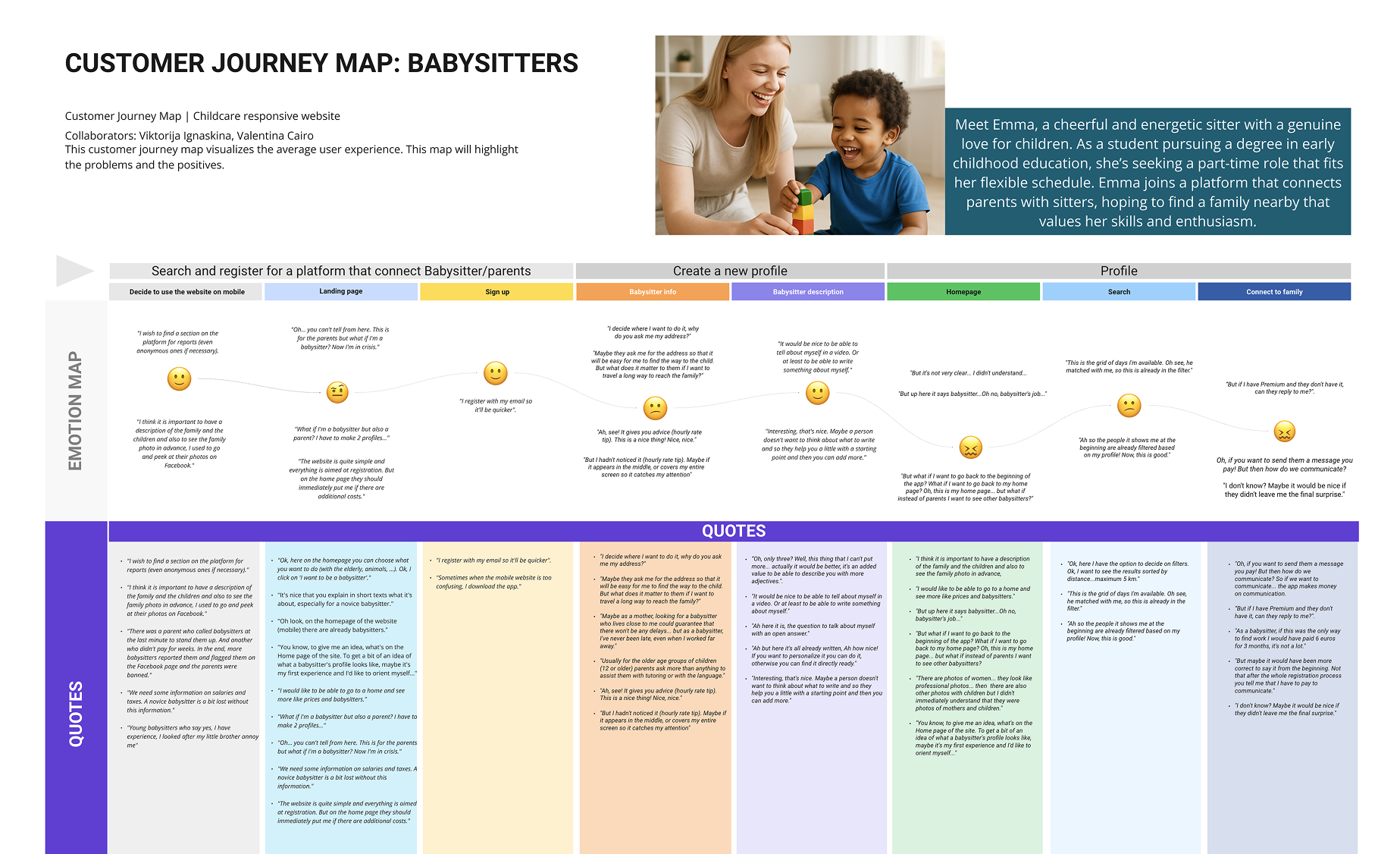
Emma’s journey: challenges and opportunities
Emma, a university student with childcare experience, was eager to find babysitting jobs. She arrived on our platform ready to sign up, but immediately encountered confusion. Was this website meant for parents or also for babysitters? The homepage didn’t make it obvious, leading to unnecessary friction.
As Emma continued, she faced different, yet equally critical, challenges:

Maria’s journey: challenges and opportunities
Maria, a working mother of two, had always struggled with finding trustworthy childcare. She landed on our homepage after a quick Google search, instantly drawn to its bright, welcoming colors and reassuring testimonials. However, her excitement quickly turned into hesitation. Where were the prices? Would she need to pay to contact a babysitter? Could she trust the reviews?
As Maria explored the platform, she faced several key challenges:

Phase 1: The problem
Phase 2: The solution
The process so far has helped us define and articulate the problems, identifying numerous points of friction and opportunities for improvement. This served us as a framework to design effective flows and interactions, which later guided us to implement and test the solution.
Moodboard
To effectively visualize, communicate and align the team to the emerging design direction, we created a mood board of visual references. The mood board effectively communicated the desired look and feel of our platform.
We researched competitors – existing babysitting websites, apps, and tools – and design trends and inspiration on platforms like Pinterest and Dribbble to ensure the visual design communicated its core qualities:
- Clear – We looked for websites, apps and design elements that prioritized ease of use and understand through the strategic use of white space and clear, legible typography.
- Playful – We found websites or apps that recall childhood and that showed their playful side through the use of color, shape, animation, or illustration.
- Trustworthy and safe – We found images, texts and websites that conveyed a sense of trustworthiness through their designs.
Design system
After defining the visual direction through a mood board, we developed a basic design system inspired by well-known web design libraries like Google Material Design. This helped us maintain visual consistency across the entire website. The system included a defined color palette, typography, and essential UI components.
Colour palette
We began by selecting a color palette that balanced feelings of joy and safety. Our starting point was a carefully chosen homepage banner image, selected for its neutral tones and a single playful accent color. This accent color was then used consistently to represent families and children.
Recognizing that the platform serves two equally important user groups, we introduced a complementary color for babysitters. This second color was chosen to convey cleanliness, calm, and trust—values that are especially important to parents when selecting childcare providers.

Font styles
Typography plays a key role in shaping the personality and usability of a digital platform. For a babysitting service, it’s essential to strike the right balance between clarity, trust, and a friendly, playful tone. With this in mind, we carefully selected a combination of typefaces that reflect our brand values and enhance the user experience across different touchpoints.
Poppins for text, quotes, and buttons: it is a geometric sans-serif font known for its clean lines and modern look. It’s easy to read, which makes it perfect for body text and interface elements like buttons. The roundness of its letters adds a friendly and approachable tone without sacrificing clarity. It gives the platform a professional yet soft feel, ideal for communication around childcare.
Urbanist for subtitles and headers (H2–H6): it is a versatile, minimalist sans-serif typeface designed for the web. It strikes a great balance between elegance and simplicity. As a header font, it feels modern and structured, enhancing the trust and clarity aspects of your brand. Its design ensures hierarchy and visual consistency, helping users easily scan and navigate content.
McLaren for the Homepage Main Title (H1): it has a casual, handwritten feel that’s still highly readable. It’s a display font with personality, perfect for a hero title. It immediately introduces a sense of playfulness and warmth, which makes the homepage feel welcoming and child-friendly.
UI elements
In addition to colours and typography, we carefully designed UI elements to support the overall visual identity. Buttons, cards, and image containers feature rounded corners, contributing to a soft, approachable look that aligns with the platform’s family-friendly character.
We also made deliberate use of white space to give the interface room to breathe. This helps reduce visual clutter, improves readability, and creates a calm and reassuring experience for both parents and babysitters navigating the site.
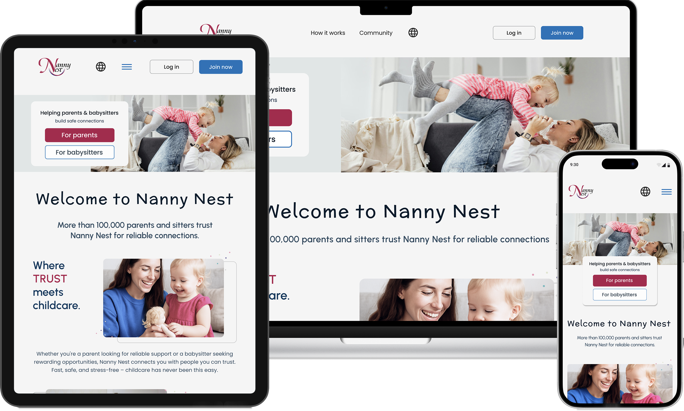
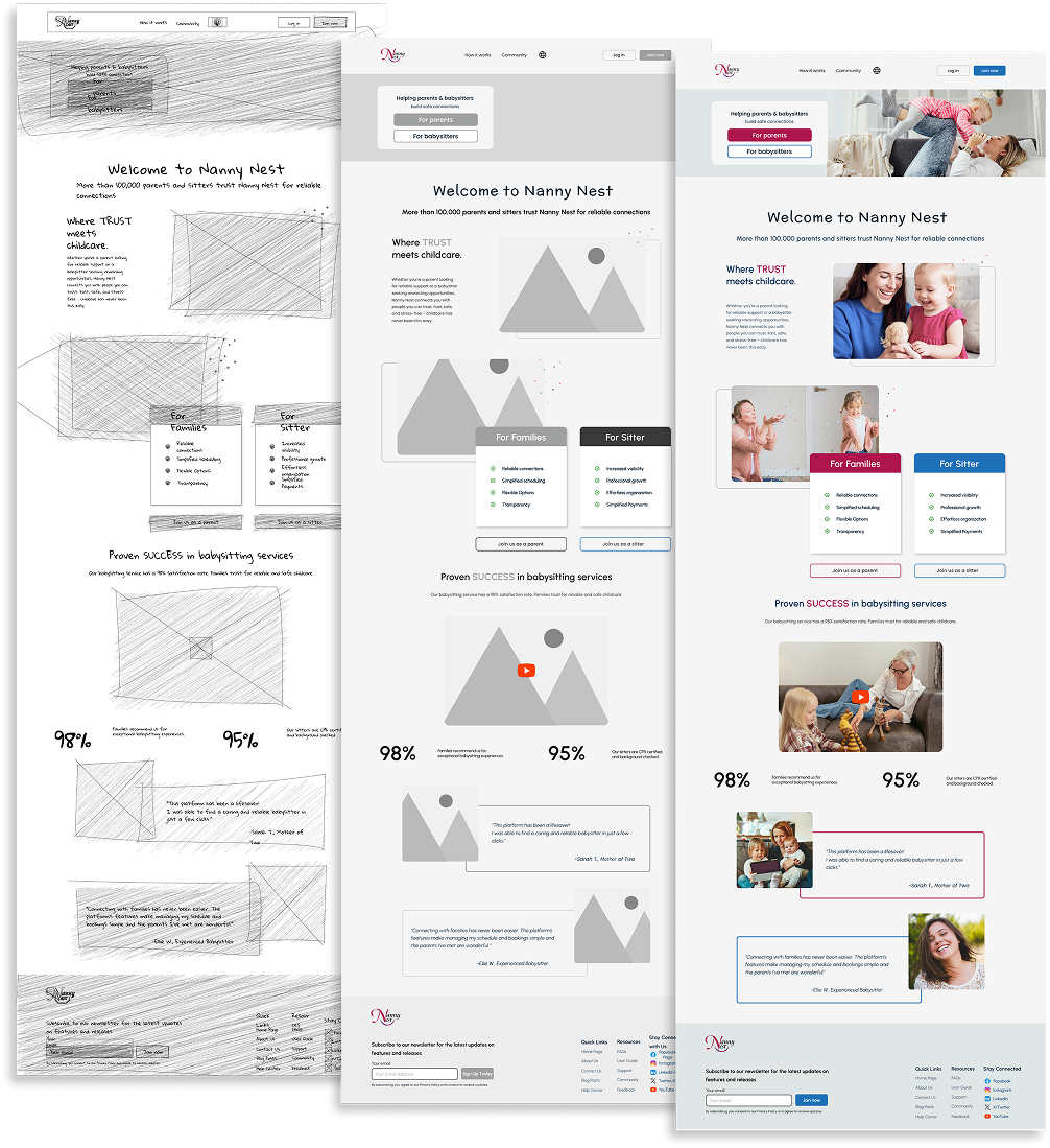
From Lo-Fi to Hi-Fi prototype
Overview
In this phase, we transformed our initial ideas and low-fidelity wireframes into a fully designed, high-fidelity prototype of the platform. The goal was to create a clickable, visually refined prototype that we could test with a select group of users.
Tools and workflow
We used Figma as our main design tool to build the prototype. Collaboration within the team was crucial: we divided the work based on user flows and used shared libraries and components to ensure consistency.
Applying the design system
We incorporated the design system defined earlier in the project. This included:
- The color palette designed to convey trust and joy
- The selected typography system (Poppins, Urbanist, McLaren)
- Rounded UI elements to create a friendly and safe look
- Generous white space to enhance clarity and visual comfort
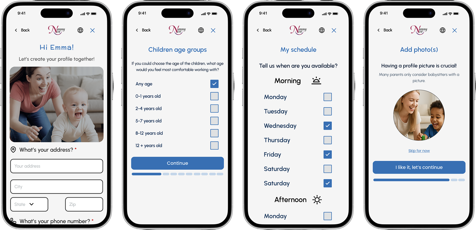
EMMA & MARIA needs always in mind
Throughout the transition from sketches to low-fidelity wireframes and high-fidelity prototypes, we focused on addressing the real needs of both key user groups: parents and babysitters.
For parents, clarity, trust, and ease of navigation were crucial. We prioritized features like sitter reviews, availability filters, and a guided onboarding to make finding childcare intuitive and stress-free.
For babysitters, we emphasized profile visibility, a clean job-matching interface, and community access — ensuring they feel empowered and supported in finding meaningful work.
Every design iteration reflected feedback from user interviews and testing, helping us refine both visual hierarchy and functional flows that serve each group effectively.
Looking ahead
As a team, we are excited about the progress we’ve made so far, while the project keeps evolving. With each iteration, we continue to refine our platform based on user feedback and insights. Since this is a project for a fictional client, we have the freedom to experiment, learn, and push boundaries without constraints.
Moving forward, our focus will be on prototyping and testing our solutions, ensuring that both parents and babysitters find real value in our platform. Whether it’s through refining onboarding flows, enhancing trust and safety measures, or optimizing user navigation, our goal remains the same: to create a childcare platform that truly supports the people who rely on it.
This is just the beginning, and we can’t wait to see where this journey takes us next.